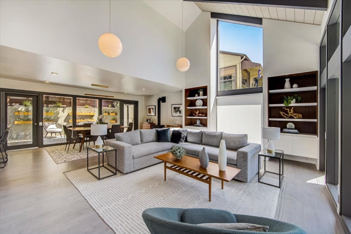
Color plays a huge role in setting the mood of your room. And if you’re looking for a fun DIY project to tackle, what better way to spruce up your space than with calming paint colors to create a relaxing home base? Whether you’re adding Feng Shui into your interior or deciding on ways to revamp a bedroom, we’ve got you covered. We reached out to experts from Tampa, FL, all the way to Toronto, ON, for their advice on choosing the best calming paint colors for your home. From soothing blues and greens to warm browns and beiges, these are the hues that’ll help you achieve a serene home.

Calming paint colors for your home interior
Muted Rose. With fall around the corner and jewel-tone focal points, your interiors should emulate harmony. A mid-tone muted rose hue would be a wonderfully unique yet great option that inspires soothing earthy influences while keeping the space calm and inviting. Sulking Pink by Farrow & Ball offers that perfect romance between texture and sophistication, making it a great choice for a guest room or a complementing rose accent wall in an otherwise minimalistic space. -Deboshree Dutta, RoomPlays
Light blue-greens and soft turquoise are essential for a calm environment. When it comes to furnishings and decor, many find neutral colors easy and comfortable. The challenge is how to add color. Pops of color disturbs an otherwise soothing environment. So, a great way to introduce color is by painting your walls a subtle blue/green or even a slightly bolder turquoise. Want to keep the walls a classic white? Paint the ceiling a soft blue/green tone in a satin finish. You’ll find the room instantly relaxing and mentally comforting. These same peaceful hues will complement any wood finish and jewel-toned upholstery, and even stainless steel appliances. Using these lovely soft blue-greens throughout your home or on your walls will harmonize your space and resound with calm and pleasantries. -Angela Carroll Ast, ABCA Design
Choose calming colors in light shades of blue, blue-grey, white, pink, and green. These colors are nature’s soothers, and you can add accent colors or touches to liven these colors up, such as a decorative pillow, a painting, or a plant to bring life and nature into your house. When considering the colors and accents, experiment with your Feng Shui element colors determined by the year you were born. For example, a metal element born in years ending in 0 or 1 would gravitate to metal colors – white, grey, silver, and gold, which could be the main color for the living room. Earth creates metal, and earth colors support those with a metal element year of birth. With this in mind, the accents could be yellow, orange, or brown earth colors. Pastel blues would support a wood element born in years ending in 4 or 5 as water feeds wood. They could have accent colors in shades of green or teal. With more time spent inside the house, you may want to relook at your home environment or give it an energetic yet restful boost. –Lydia Anne Mitchell
Warm neutrals. A favorite Feng Shui-inspired color to create a serene space is aptly called Calm by Benjamin Moore. This warm grey color is a great neutral that works with just about any shade of flooring and can be used in many design styles. Benjamin Moore’s Calm 2111-70 creates a warm, cozy and soothing atmosphere, giving you the sense of serenity you need when you walk into your home. It’s like bringing nature right into your home. –Mindful Living Interiors
The most soothing paint colors are calm and shaded tones, depending on the room’s location. For example, the warmer southern rooms require more yin color palettes, such as sage green and neutrals. These colors work best in the south-east, south, and south-west directions, creating a calm and relaxing environment. On the opposite side, the cooler sides of the home require more yang colors. These directions are the north-west, the north, and north-east, where slightly warmer tones need to balance the energy. The best choices would be dusty rose or hints of lavender in such spaces to create a serene ambiance. From a Feng Shui perspective, a serene home is achieved with a balanced design through positioning and harmonic color tones. –Maša Zorn
Try Benjamin Moore’s Whitestone to bring light to your home interior or workspace. If you’re one of the many people who have started working from home, you may find that a better-designed, clutter-free home office makes it easier for you to get better work done in less time. The application of Benjamin Moore’s Whitestone (2134-60) creates the perception of more space while also adding the cozy feeling of a light and soft blanket. I love the slight blue undertone, which plays nicely with whatever light source is present at any time of day, illuminating the room and creating a peaceful and serene mood. –Fernanda Cunha Interiors

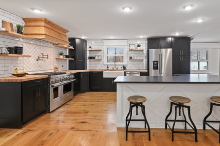
Nature-inspired colors are best for the kitchen
Benjamin Moore Hollingsworth Green. Your health, abundance, and relationships are nourished within the kitchen, and Benjamin Moore Hollingsworth Green is a perfect color to relax and support the kitchen’s innate yang (active) energy, coupled with soft whites and natural wood accents. When creating a relaxing color palette for this space, let nature be your source of inspiration to help beneficial energy flow. –Natalie LaBonte
Enhance a white backdrop with blue and green accents. Besides being the color of purity and cleanliness, white shows off the colors of food as if it were a blank canvas. You might select simple Shaker white-painted cabinets with a contrasting countertop or a (mostly) white quartz backsplash and countertop supported by beautiful wood grain cabinets. Just like an artist, you’ll relax as you create beautiful and delicious meals while adding your favorite splashes of color, possibly in relaxing blue/green, in functional accessories such as kitchen towels, fresh flowers, or herbs. –Transformation for Interiors
Bring in good vibes with the color yellow. A vibrant, yet soothing, kitchen color is a beautiful sunshine yellow. Known as the color of joy and health, yellow is also associated with the solar plexus chakra, which pertains to the stomach and digestion. It’ll enhance the enjoyment of delicious food and good company in your kitchen. –Vibrant Interiors
Balance neutrals with accent colors. The kitchen is full of activity, so try a subtle palette to make it more relaxing with neutral shades, like Benjamin Moore’s Ivory Porcelain or Wind’s Breath – both look great on most surfaces. Add in Riviera Azure or Spring Lilac to add just the right amount of visual interest. Remember to choose low VOC paints for better indoor air quality. –Sophia Calima (@designersophiac)
Try cozy earth tones. While there’s a strong trend towards an all-white kitchen, you can still keep it neutral with earth tones. In the rolling hills of western Massachusetts, I often recommend keeping your color scheme calm and serene, taking inspiration from where you live. Consider painting your cabinets a soft green like Benjamin Moore’s Fernwood Green and topping them off with a gorgeous soapstone countertop that has veiling in a similar soft green. –Jen Heilman

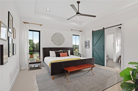
Encourage relaxation with classic neutrals and blue-greens for the bedroom
For a calming bedroom, go for muted colors that’ll unwind and relax you before falling asleep. Keep in mind, it’s not just about paint colors but the whole bedroom’s color scheme, including furniture, home decor, and even bedding. Choosing colors for your bedroom should always reflect your personal style. –Julie Rawding Interiors
Use warm neutrals and earth tones set against a white backdrop as a calming paint color palette. As a Feng Shui practitioner, I am always looking for paint colors that help enhance the energy in a person’s space while making it aesthetically beautiful. My favorite “go-to” paint color for bedrooms is Benjamin Moore OC-7, Creamy White. This color provides the perfect backdrop for most color palettes. I especially like using warm neutrals and earth tones in bedrooms since I base bedroom design and decor on the Love & Relationships Gua guided by the Bagua Map. –Alejandra G. Brady
Seek out the quiet colors seen in nature that are more neutral. When choosing a paint color for your bedroom, consider how you want the space to feel (ex. cozy, calm, relaxing). From there, look to nature, grab a camera and capture your favorite spaces, or even photograph your artwork. Think of the soft greens that you would see on the backs of leaves, windblown beach sands, moonlit glow, sunlit misty mornings, bubbling brooks, and river rocks. These neutrals will appeal to your senses and provide an excellent backdrop for smaller accent pieces in your décor. Two of my favorite bedroom color choices, inspired by nature, are Benjamin Moore’s Foggy Morning and Sherwin William’s Morris Room Grey. –Cloud 9 Feng Shui
Warm pastels in light beige or taupe. The best colors for a relaxing bedroom are the ones that bring soft and calming vibes to induce you into a relaxing mood. Warm pastel colors such as light beige or taupe are not only relaxing and elegant but also bring a neutral atmosphere for you to have more flexibility when changing out your decor or furniture. –Dalalba
Sherwin Williams Sea Salt and Benjamin Moore Gray Owl. Incorporating tints of softer blues, greens, and greys create the calming atmosphere we crave after a busy day. Paint colors have a lot to speak and convey. And in a space like a bedroom that we often return to after a long, hard working day, our minds tend to fall for such calmness and tranquility. –NISH
Choose colors that complement the combination of elements in a room. According to Traditional Feng Shui calculations, the colors chosen for a relaxing bedroom are based on the combination of elements permanently inherent in the room. The color or colors used to create balance and harmony are based on the Flying Star System. For example, if metal energy were predominant in the bedroom, you would want to soften the energy by painting the room a calming blue hue. Or, if there was strong earth energy, you would want to consider a soft white hue with an accent wall in a calming grey. –Feng Shui Integration
Incorporating light blue, soft sage, or a cream will help free your mind of any clutter. Adding in a soft pink, like Benjamin Moore’s Warm Blush, can act as a cozy and neutral accent color for a relaxing bedroom. Your bedroom paint color should evoke a sense of peace and serenity, allowing you to relax at the end of the day. –Chrissie Home and Design
When choosing colors for the bedroom, think sensuality and intimacy rather than bold, bright, loud colors. The purpose of the bedroom is to calm, reset and recharge. To set the tone for self-connection and relaxation, choose warm skin tones – creamy beiges, smooth mochas, blushing pinks and peaches, pastel yellows or light purples, and rich earth tones of reds. Benjamin Moore has chosen “First Light” (2102-70) as the color of the year for 2021, and I also love Early Sunset as a base (2096-70) with Light Mocha as an accent wall (2096-60). –Christine Gipple
Originally published by Redfin (all images are from original article)


